My Homemade Charts on the Bush Budgets
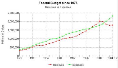
Chart 1: Clinton Recession/Bush Tax Cuts

So Spending Rates Increased During Bush's first term, but if you dig into the details at the Gov't Website, you'll see that if was largely defense and unemployment benefits
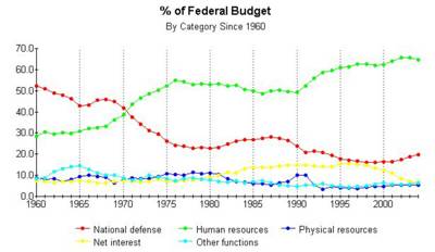
Chart 2: Domestic vs Defense as a share of the Total Federal Budget or Why Nixon Stinks as a Conservative

To be fair, Nixon inherited the costs of Johnson's Great Society, but isn't it staggering to see the rise of entitlement/social spending in the 1970-74 period as a % of the total federal budget.
You also have to admire Reagan. His budget record tracked his rhetoric: Social spending (as a % of total budget) actually declined during his tenure, while defense spending rose.
The Clinton Legacy? It clearly is one of inheriting a peace dividend to slash defense spending (declined as a % of total throughout his tenure) and accelerating social spending nearly as fast as Nixon. He lucked out with a great economy to pay for it all.
The first Bush Term? Similar to Reagan..Defense is growing as a % of total, while social spending is leveling off and falling after the increases due to unemployment to help folks who suffered from the Clinton Recession.
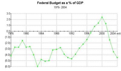
Chart 3: Not Great, but we've been here before:

I worry about the Deficit as a Share of the GDP. Bigger economies can handle bigger deficits in the same way that a $50,000 credit card bill would impact Bill Gates a whole lot less than it would bother me.
The US GDP has more than doubled since 1976.
But I'd like to see it move the other direction...that's what a good economy should do for us.

<< Home